Monday 9 June 2014

Composition Photography

Balance
There are two of them on each side with one in the middle, making is symmetrical.  
 Framing Man-Made
The statue is surrounding the water tower. Emphasizing it. 
 Leading Line
The line of lockers is leading through the hall.
 Movement
The angle of the halls are to the door. Pointing upward.
 Pattern Regular
Each step is similar to the others and creates a pattern leading up the stairs.
Rule of Thirds
The flower is on the far left of the photo, 1/3.

Friday 16 May 2014

The Photo Essay - Electricity

  The Electricity class have just finished an interesting lesson. After that they worked on their assignment for the rest of the period. 
The students use a lot of different tools. They have to be very precise to make sure everything works properly. 
It takes a lot of time to get things exactly right. Patience is key.
Students will often help each other out. It often takes more than two hands anyway.
If they are really stuck they will ask their teacher. In this case the students can get help from Mr. Hellmuth & Ms. Parkes-Russell.
When a lot of people need similar help a small group will start to form. It gives a chance for people to help each other out.
A student that keeps at their work will get it done quickly. It gives them time to help other people.
Not everything is going to get done in one period. That also means not everyone is going to work that period.
The work is pretty simple but can be pretty hard. It just makes the end result is just that much more satisfying.

Tuesday 15 April 2014

COMPOSITION IN PHOTOGRAPHY

Rule of Thirds
 
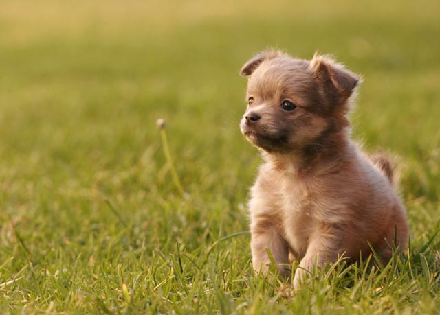
I chose it because it is simple. Its a good example because the dog is on the vertical 3/3 of the photo.
Leading Line
I chose it because it has a main subject, the windmill. Its a good example because the fields are lines and lead to the windmill.
Breaking Pattern
I chose this because I like how the red flower stands out. Its a good example because the red breaks the white pattern.
Selective Focus - Depth
I chose it because its simple and stands out. Its a good example because The yellow ball is in focus, while the orange one is out of focus.
Framing
I chose this because I like that the frame is natural. Its a good example because the cave is framing the landscape.

Monday 24 March 2014

Spring Sensations Poster & Tickets


I chose this layout because it was simple. I thought it would be easier to make a cello than a bird, in another thumbnail.
I chose my poster design based around the colours green, blue and red/pink. The red text and cello are supposed to stand out against the blue and green. There's a variety of colours with a unity of shades.
The layout focuses on the tree in the foreground. Then there's the cello in the mid ground and the background.
A sense of movement might be in the music notes, moving right, from the cello or your eye moving from the tree to the cello.

     Creating The Poster:
  1. Coloured in the background
  2. Added the text
  3. Drew the tree 
  4. Added the cello and music notes
In the tickets are use the cello which I thought stood out the most that would also be the easiest to recreate.
I added the music notes for a sense of unity.

Tuesday 25 February 2014

Poster Design

All sizes | Kanye West | Lost In The World | Flickr - Photo Sharing!
This Poster uses the big red font to make it stand out against the white background because they contrast.
The font and colour is also different from the rest of the poster so it stands out.
The red font is rough while the black is just square.
The font take up the whole poster. 

CREATIVE ADS: Lego - The Shadow Knows (4 total) - My Modern Metropolis
This poster uses yellow bricks to contrast against the green background. Green and yellow are analogous colours. The bricks are just above the center of the poster, so it stands out.
The font is really small and in the corner. There is a lot of empty space.
City Cab Poster by Mehmet Gozetlik | TrendLand: Fashion Blog & Trend Magazine
This poster uses the green car because it contrast with the yellow background. The white text is right under the car, so its probably the next things people will see. The text is white so it makes a green, white pattern with the car. The car is 2/3, vertically, of the poster.

Thursday 20 February 2014

Postcard


I chose the JPG because it good for pictures with many colours and it allows high quality viewing from programs.

The background image is 1440 x 1080

I picked everything so it would contrast against the black background.
The white text on black and the graphic effect around the astronaut.
First I put the background, then I used the wand to paste the astronaut. I then used mask to paste the rover.
I used the stamp tool to make the effect around the astronaut. Finally I typed the words.